Bug report #4211

Enhancement: make "actions" tab more consistent and less confusing
| Status: | Closed | ||
|---|---|---|---|
| Priority: | Low | ||
| Assignee: | - | ||
| Category: | GUI | ||
| Affected QGIS version: | master | Regression?: | No |
| Operating System: | All | Easy fix?: | No |
| Pull Request or Patch supplied: | No | Resolution: | |
| Crashes QGIS or corrupts data: | No | Copied to github as #: | 14175 |
Description
Some features of the actions tab are inconsistent or confusing. In particular:
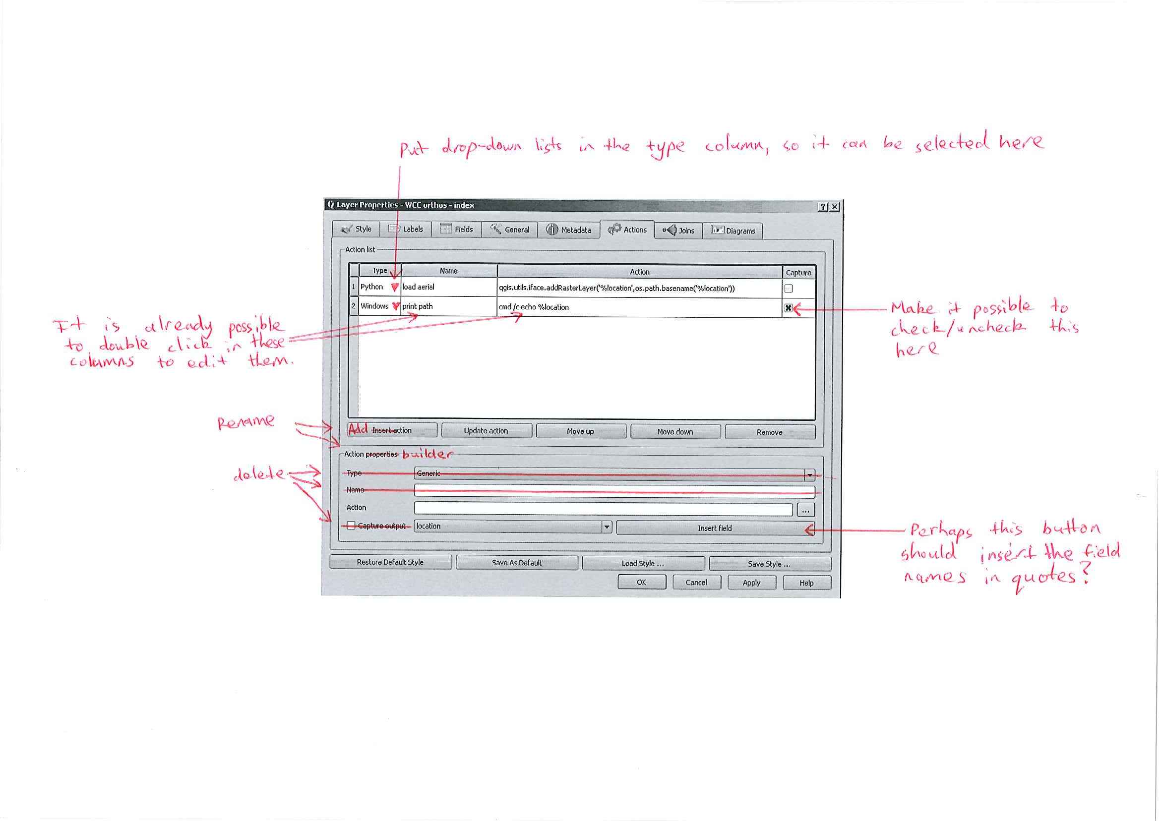
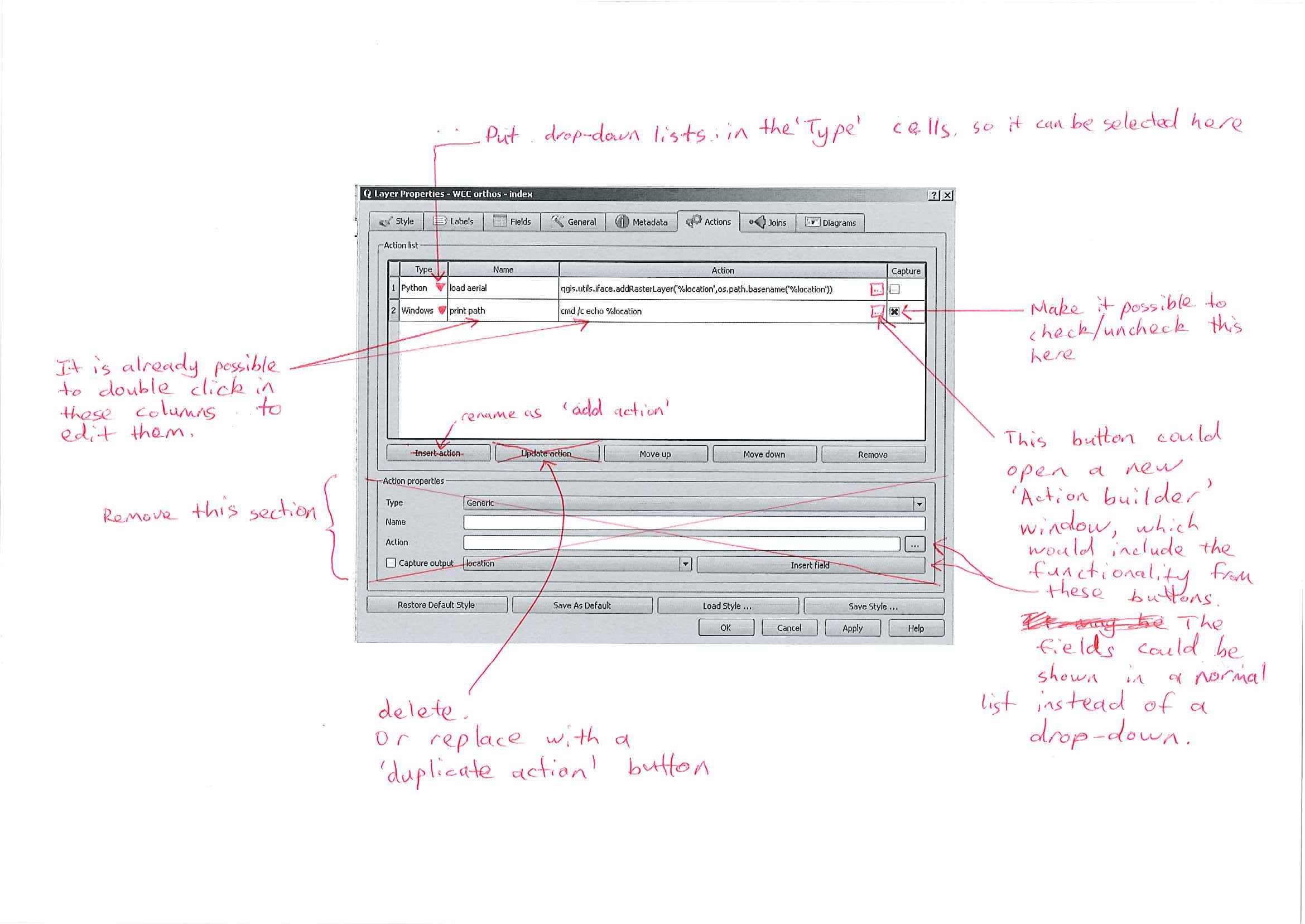
1. It is possible to edit the "Name" and "Action" cells directly in the "Action list", but it is not possible to edit the "Type" and "Capture" cells directly in the "Action list". It would be good if all the columns could be edited directly in the "Action list".
2. In the "Action properties", the first three rows consist of a label ("Type", "Name" and "Action"), and widgets relating to that label. A user is therefore likely to think that in the fourth row the field selector and the "insert field" button somehow relate to the "capture output" checkbox. They do not. It would be good if this was cleaned up.
If all the columns in the table were directly editable (refer to 1 above), then it might be best to remove the "Type", "Name", and "Capture output" widgets, and rename "Action properties" to "Action builder". See my first mark-up.
Alternatively, it might be good to remove the entire "action properties" section, and add a button in the "Action cell" to open a separate "Action builder" window. See my second mark-up.
I think I prefer the first alternative, as a separate "Action builder" window seems quite unnecessary.
Associated revisions
make "action" tab less confusing (partially fix #4211):
display add and update buttons below the edit action widget (following the "new shapefile" UI style)
move the "capture output" checkbox away from the "insert field" combo
History
#1
 Updated by Alister Hood almost 15 years ago
Also see #4210
#2
 Updated by Nathan Woodrow almost 15 years ago
Personally I like the second mark up. Less UI items is sometimes better and I don't think having a small popup here would be a bad thing. The best thing about Qt is you can make both UIs in Qt Designer and then add a bit of Python coding to see how they would feel better compiling the main code.
#3
 Updated by Giovanni Manghi over 14 years ago
- Target version set to Version 1.7.4
#4
 Updated by Paolo Cavallini over 14 years ago
- Crashes QGIS or corrupts data set to No
- Assignee set to Giuseppe Sucameli
- Affected QGIS version set to master
#5
 Updated by Giuseppe Sucameli over 14 years ago
- % Done changed from 0 to 100
- Status changed from Open to Closed
Fixed in changeset 35f5da70cdb7c26ec1e082fb8a6fbb5b6a44c45d.
#6
Updated by Giuseppe Sucameli over 14 years ago
- Status changed from Closed to Reopened
- % Done changed from 100 to 30
It's partially fixed.
#7
Updated by Paolo Cavallini over 14 years ago
The column widths are not appropriate: Capture should be much smaller, with most space devoted to the action itself (currently quite nerrow)
#8
Updated by Giuseppe Sucameli over 14 years ago
- Status changed from Reopened to Closed
- % Done changed from 30 to 100
Fixed in changeset commit:"0f24f21280115931062d8ab0b7fff86023d2b382".
#9
Updated by Giuseppe Sucameli over 14 years ago
- Status changed from Closed to Reopened
- % Done changed from 100 to 30
The ticket was automatically closed due to a backport of my commit from master to another branch.
I open it again, it's partially fixed.
#10
Updated by Giuseppe Sucameli over 14 years ago
- Target version changed from Version 1.7.4 to Version 1.8.0
#11
Updated by Alister Hood almost 14 years ago
- File New_mockup_1.png added
- File new_mockup_2.png added
it's partially fixed.
For the benefit of future readers: the more confusing aspects of this dialog have been eliminated.
But I still think it would be great to simplify this tab, and I guess doing so would make it a lot more useable on small screens.
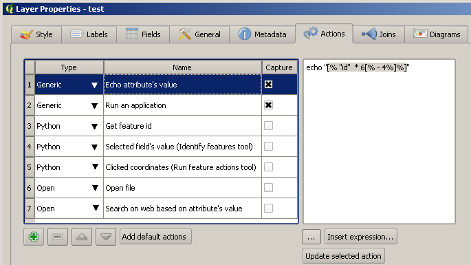
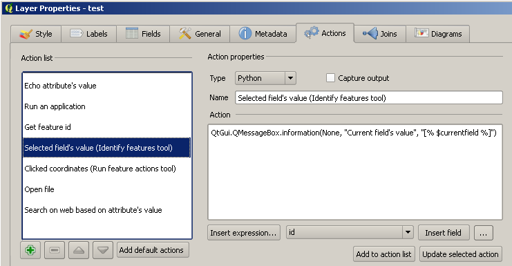
What does everybody think about doing something along the lines of one of these new mockups? The actual buttons and grouping probably aren't quite right, but you should get the idea.
#13
Updated by Alister Hood almost 14 years ago
- File deleted (
New_mockup_1.png)
#14
Updated by Alister Hood almost 14 years ago
On another note, there's an inconsistency that in other parts of the gui a "..." button is used to open the expression builder. But here it opens a file selector which just inserts the filepath, while the expression builder has a separate "insert expression..." button.
Would it perhaps be possible to add a file path selector into the expression builder, and get rid of the separate file selector button?
#15
Updated by Alister Hood almost 14 years ago
- File deleted (
New_mockup_1.png)
#16
Updated by Alister Hood almost 14 years ago
- File New_mockup_1.png added
Slight improvement again.
Note: this is kind of modelled on the symbol properties dialog, so if that changed significantly it might be worth following suit.
It might be good to remove the "add to action list" and "update selected action" buttons too.
#17
Updated by Nathan Woodrow almost 14 years ago
I agree the action UI still feels cluttered. I like New_mockup_1 the most as it is a clean and removes the cluttered. I also agree that the 'Add to action list' and 'Update selected action' buttons should be removed, updates should be live.
#18
Updated by Paolo Cavallini almost 14 years ago
- Target version changed from Version 1.8.0 to Version 2.0.0
#19
Updated by Paolo Cavallini over 13 years ago
- Assignee changed from Giuseppe Sucameli to anonymous -
#20
Updated by Giuseppe Sucameli almost 13 years ago
- Status changed from Reopened to Closed
Fixed in changeset 35f5da70cdb7c26ec1e082fb8a6fbb5b6a44c45d.
#21
 Updated by Jürgen Fischer about 12 years ago
- Assignee deleted (
anonymous -)