Feature request #10378

field calculator bar: improve consistency with label "bar"
| Status: | Closed | ||
|---|---|---|---|
| Priority: | Normal | ||
| Assignee: | |||
| Category: | Attribute table | ||
| Pull Request or Patch supplied: | No | Resolution: | fixed/implemented |
| Easy fix?: | No | Copied to github as #: | 18797 |
Description
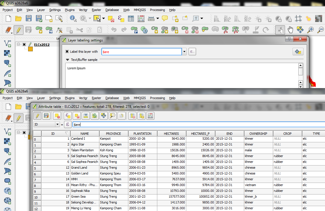
As a starting point, see the attached screenshot which puts the label "bar" (i.e. the field / expression text/drop down at the top row) next to the field calculator bar. IMO, it would be good to try and improve the visual consistency here.
Suggested improvements (in order of importance):
1. The way the label text box indicates an invalid expression by coloring the letters in red is a really nice user experience, it should also be the case in the field calculator bar
2. The height of the field calculator bar's main text widget is too small, and makes it very unfriendly for Indic-based scripts (like Burmese, Lao, and Khmer writings) which usually takes much more vertical spacing. It's also not consistent with the label bar. I'd advice to increase the vertical height of both the text box and the drop down field list to match the label bar (and be non-Latin script friendly)
3. The "E" expression logo should be the same
Hope this helps.
History
#1
 Updated by Matthias Kuhn almost 12 years ago
I like these suggestions.
1. For visual feedback it would be nice to test the possibility of having a softer red as lineedit background color instead of the current red font visible in your screenshot. I think it would be much more pleasant to look at.
2. No idea.
3. Agreed
#2
 Updated by Mathieu Pellerin - nIRV almost 12 years ago
I like Matthias' idea of playing around with background color too. Whatever is decided, apply to both :)
Regarding point #2, it's about making the text box's height to match the E expression button, so it won't eat up any additional vertical spacing, look better, and be Indic friendly.
#3
 Updated by Nyall Dawson almost 12 years ago
Actually, I think the label's expression button should be edited to remove the "..." part. It makes the icon very small and is inconsistent with the rest of the GUI (eg, the label settings button to the right doesn't have a "...").
#4
 Updated by Nathan Woodrow almost 12 years ago
I agree I think the label expression icon is too small.
The other ideas are fine and I will add them after release as they are more features then bugs.
#5
Updated by Mathieu Pellerin - nIRV almost 12 years ago
The big E is also what I'd go for.
Nathan, re red coloring of invalid expression, I have no strong feelings waiting for 2.6, but could the height of the text box n drop down list elements be increased if its only a ui file change? I ll send a screenshot to demonstrate the usability issue.
#6
Updated by Mathieu Pellerin - nIRV over 9 years ago
- Resolution set to fixed/implemented
- Status changed from Open to Closed