Feature request #21385

Mesh Layer styling: on Windows not so clear how to select the Group
| Status: | Open | ||
|---|---|---|---|
| Priority: | Normal | ||
| Assignee: | - | ||
| Category: | - | ||
| Pull Request or Patch supplied: | No | Resolution: | |
| Easy fix?: | No | Copied to github as #: | 29202 |
Description

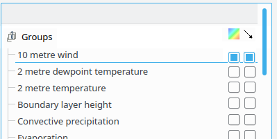
Left is Windows right is Linux same dataset/QGIS version.
As you see in the Windows box, it is not as clear as in the Linux box that one of the layers/groups is 'active'. Also I saw users click on the name of the group and then nothing happens, because you have to click on the little 'button/icon' to the right. Which on Linux are more or less visible as 'buttons', but on the Windows screen (not so big screen) as you see it is one big grey bar in which it is not obvious that you have to click on it next to a group.
I'm not sure what the easiest or best solution is here:
- Either make the Groups in Windows more or less look the same as in Linux (though it is not super clear either there in my opinion)?
- Add visibility checkboxes in front of every group row?
- Make the name clickable too, so clicking the name already makes it visible (though that is maybe tricky).
Anyway, as said, this is a feature request, it's not a real issue. Thanks.
History
#1
 Updated by Jürgen Fischer almost 7 years ago
- Description updated (diff)
#2
 Updated by Saber Razmjooei almost 7 years ago
@Richard, will something like that work for you: #20144
It will be consistent with the general layer visibility in layer panel too.
#3
 Updated by Richard Duivenvoorde almost 7 years ago
Saber Razmjooei wrote:
@Richard, will something like that work for you: #20144
It will be consistent with the general layer visibility in layer panel too.
Thanks!
Yes, that looks great what you propose there:
Though maybe the checkboxes in front of the names?
And I'm not sure how to handle the fact that for the directed arrows you would handle to NOT have this possibility in most of the groups: not show it? Or make it inactive?
And not sure if you show/propose a treeview there?
I think that would be cool too, as in netcdf's you often do 4 (or 5 or 6) dimensional data, so creating a (lazy) treeview would then make it easier to select something like:
model33/100m-slice/nucleide4 (having a model which creates spatial/temporal data for 5 height blocks for 100 nucleides)
But I do understand this makes it much more complex ( it's you promoting a treeview ;-) ). I'm happy with the flat table too...
Also: see #21369 where I propose to create a sort/filter on the groups as we have nc files with >300 items.