Bug report #21212
Close and Restore buttons in panel windows look "too bold"
| Status: | Open | ||
|---|---|---|---|
| Priority: | Normal | ||
| Assignee: | - | ||
| Category: | GUI | ||
| Affected QGIS version: | 3.4.5 | Regression?: | No |
| Operating System: | Easy fix?: | No | |
| Pull Request or Patch supplied: | No | Resolution: | |
| Crashes QGIS or corrupts data: | No | Copied to github as #: | 29030 |
Description
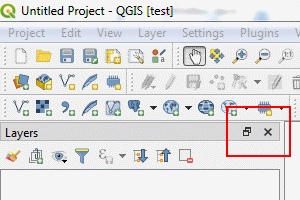
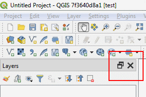
In QGIS master 3.5 7f3640d8a1 (on Windows 7 64 bit), using "Windows" or "windowsvista" application style, the "Close" and "Restore" buttons in panel windows look "too bold" compared with QGIS 3.4.1 and QGIS 2.18.
3.4.1
master
History
#1
 Updated by Andrea Giudiceandrea over 6 years ago
- Affected QGIS version changed from 3.5(master) to 3.4.5
- Description updated (diff)
The same problem is now present also in QGIS 3.4.5-1 (89ee6f6e23).
#2
 Updated by Andrea Giudiceandrea over 6 years ago
In 3.4 branch, the bug firstly appeared on Windows in QGIS 3.4.4-2 (73c31df831), while it was not present in QGIS 3.4.4-1 (f6ddc62fdb)
Comparing the commits https://github.com/qgis/QGIS/compare/f6ddc62fdb...73c31df831, it seems there are two possible related ones: b55b0ec and 22418b4