Bug report #19002
Data Source Manager: Switch "Close" and "Add" buttons
| Status: | Closed | ||
|---|---|---|---|
| Priority: | Normal | ||
| Assignee: | - | ||
| Category: | GUI | ||
| Affected QGIS version: | 3.1(master) | Regression?: | No |
| Operating System: | Easy fix?: | Yes | |
| Pull Request or Patch supplied: | No | Resolution: | duplicate |
| Crashes QGIS or corrupts data: | No | Copied to github as #: | 26833 |
Description
In most dialogs a button with an "positive" action like save/accept/OK/open appears on the left side of a button row, and "negative" actions like discharge/cancel/decline/close are arranged right.
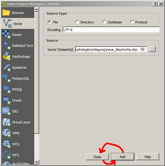
In QGIS' "Data Source Manager" dialog the "Close" button is arranged left and the "Add" button is arranged right (centered). Intuitively I would expect the "Add" button on the left side, which makes me clicking "Close" instead of adding a new layer. Therefore I would suggest to switch the "Add" and the "Close button's position.

Related issues
History
#1
 Updated by Harrissou Santanna over 7 years ago
- Duplicates Feature request #18466: Look and feel - Switch Add - Close button added
#2
 Updated by Harrissou Santanna over 7 years ago
- Resolution set to duplicate
- Status changed from Open to Closed