Bug report #9684
Improve tool grouping and color usage in toolbars
| Status: | Closed | ||
|---|---|---|---|
| Priority: | Low | ||
| Assignee: | |||
| Category: | GUI | ||
| Affected QGIS version: | 2.2.0 | Regression?: | No |
| Operating System: | Easy fix?: | No | |
| Pull Request or Patch supplied: | No | Resolution: | end of life |
| Crashes QGIS or corrupts data: | No | Copied to github as #: | 18249 |
Description
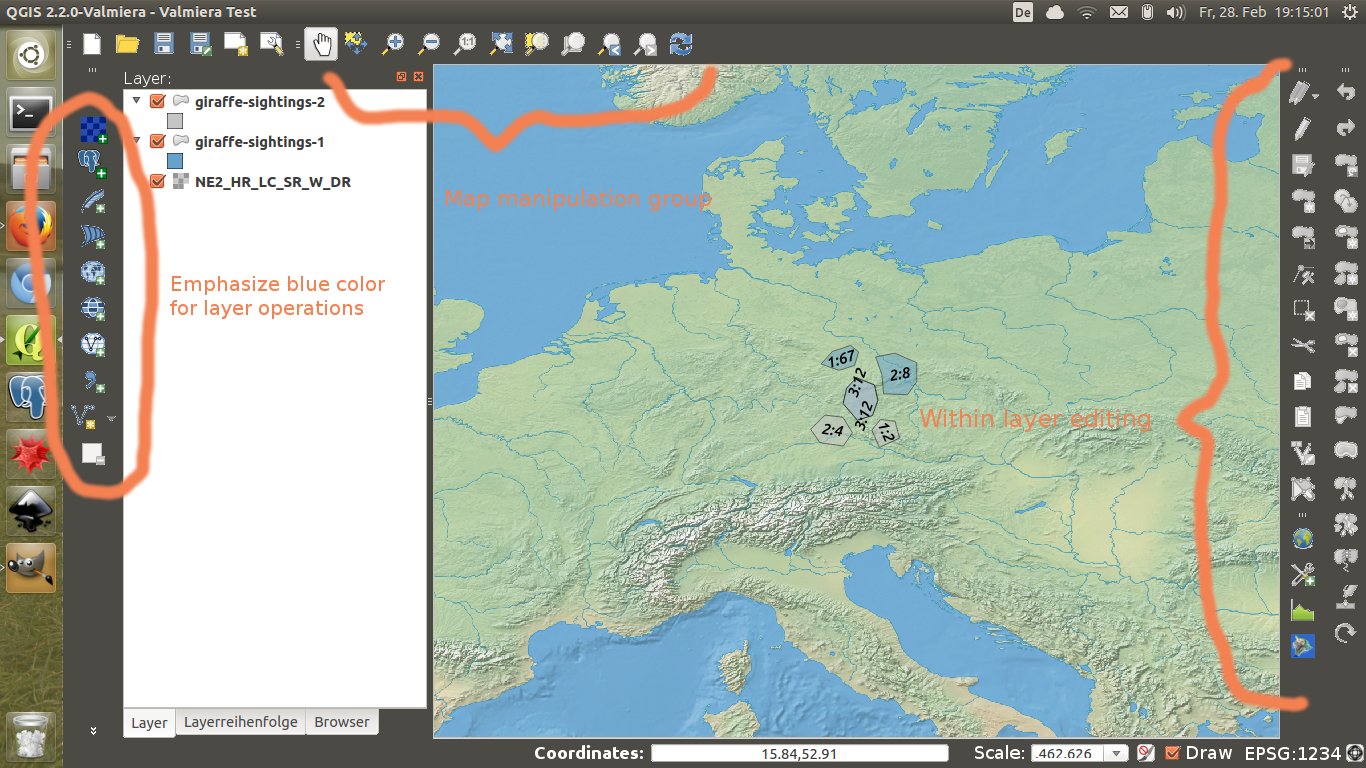
I don't know if anybody is interested in this, but the UI could be further improved using clearer groupings of toolbars. Some icons seem very out of place currently. The groupings could be further aided by using similar colours for similar concepts. Blue seems to be already established for layer operations. Selection operations could all use a lot of yellow. Polygon operations seem to be green.
In my opinion very out of place is: The "refresh view" and "draw layer" being so far apart. The attribute table and field calculator should be closer to the layers. Grouping the attribute table with the "selection" tool bar is just weird. If anybody likes the mock up I can work on it some more.
In general I think the interface should be darker to make the map pop out more. And another thing I like is putting the edit tools on the right hand side of the screen because it takes advantage of wide screens.

History
#1
 Updated by Jürgen Fischer almost 12 years ago
- Target version changed from Version 2.4 to Future Release - High Priority
#2
 Updated by Anita Graser almost 12 years ago
I think you raise some important issues about how tools should be grouped in toolbars.
Concerning your second suggestion about a dark interface: I'm against forcing a dark interface on users. Currently, the QGIS interface follows the users choice of operating system window style. Users can have dark interfaces if they want to. I don't think forcing a dark interface would improve usability.
#3
 Updated by Anita Graser almost 12 years ago
- Subject changed from UI improvement through better groupings and color usage to Improve tool grouping and color usage in toolbars
#4
 Updated by Giovanni Manghi almost 9 years ago
- Regression? set to No
- Easy fix? set to No
#5
 Updated by Giovanni Manghi almost 7 years ago
- Resolution set to end of life
- Status changed from Open to Closed
End of life notice: QGIS 2.18 LTR
Source:
http://blog.qgis.org/2019/03/09/end-of-life-notice-qgis-2-18-ltr/