Feature request #18142

Blue text on yellow background in Options menu search results is super ugly
| Status: | Closed | ||
|---|---|---|---|
| Priority: | Low | ||
| Assignee: | - | ||
| Category: | GUI | ||
| Pull Request or Patch supplied: | No | Resolution: | fixed/implemented |
| Easy fix?: | Yes | Copied to github as #: | 26035 |
Description
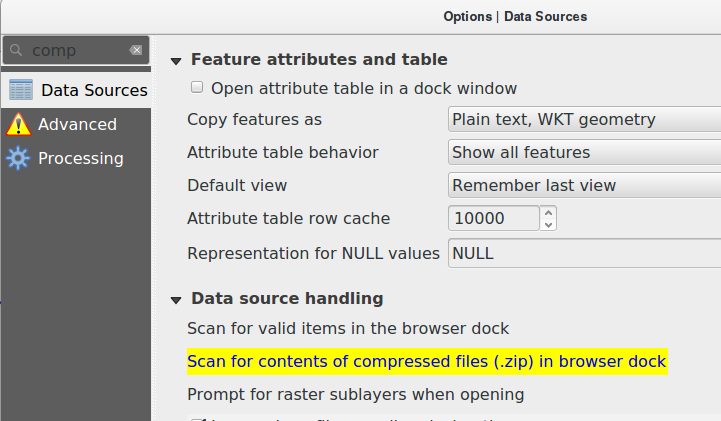
The search-as-you-type highlighting of matching options in the Options menu is great but the visualisation is bad. Right now it is a bright yellow background with blue text which clashes and decreases readability.
Please do not change the text color. That should be enough to fix this. :)
History
#1
 Updated by Regis Haubourg almost 8 years ago
- File ugly_yellow_selection.png added
- Priority changed from Normal to Low
Confirmed :)
see attached picture
#2
Updated by Regis Haubourg almost 8 years ago
- Status changed from Open to Feedback
- File better_background_v1.png added
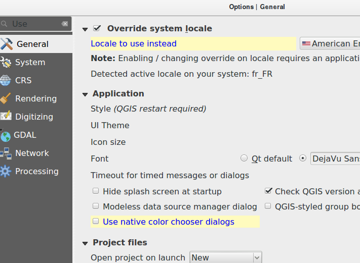
Would that be better Johannes?
#3
 Updated by Johannes Kroeger almost 8 years ago
Yes but I really would not change the text color at all.
#4
 Updated by Giovanni Manghi almost 8 years ago
- Tracker changed from Bug report to Feature request
- Status changed from Feedback to Open
#5
Updated by Regis Haubourg almost 8 years ago
- Resolution set to fixed/implemented
- Status changed from Open to Closed
Implemented in https://github.com/qgis/QGIS/pull/6581