Bug report #21936
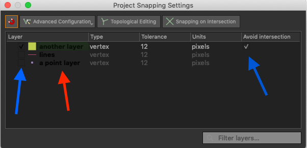
Snapping Settings window with Night Mapping, low readability
| Status: | Open | ||
|---|---|---|---|
| Priority: | Low | ||
| Assignee: | - | ||
| Category: | GUI | ||
| Affected QGIS version: | 3.4.7 | Regression?: | No |
| Operating System: | macOS | Easy fix?: | No |
| Pull Request or Patch supplied: | No | Resolution: | |
| Crashes QGIS or corrupts data: | No | Copied to github as #: | 29751 |
Description
The Snapping Settings window has an inconsistent layout and partly very difficult to read due to low contrast with Night Mapping theme (at least on macOS).
This is the present layout:
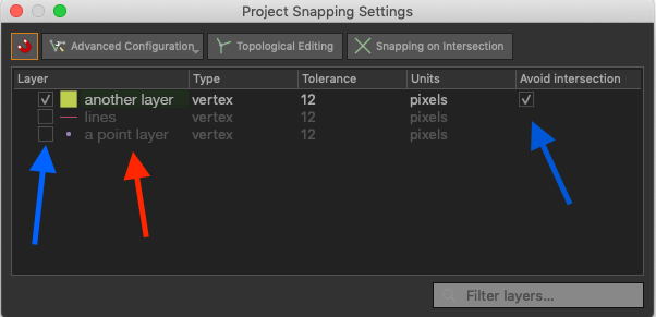
Suggested changes:
1. The checkboxes (Layer and Avoid intersection) should be dark grey not black
2. The checkmark in Layer should be light grey
3. The Layer name should be dark or light grey depending on checked or not
